Hourly Evaluation
This tutorial provides an in-depth guide for analyzing and visualizing same-day power market forecasts and is typically useful for battery operators and real-time desks. Data professionals and IT teams will find it useful in a Jupyter notebook, and it should significantly remove friction associated with assessing a vendor's forecasts.
By the end you will:
- Easily see how Enertel's real-time forecasts have predicted volatile hours.
- Be able to pick and choose hours and view how forecasts changed between vintages.
We provide samples of data to be used as inputs into this tutorial at your price nodes of interest as part of our free trial. Just reach out!
1. Data Preparation
Imports and Data
import pandas as pd
import seaborn as sns
import matplotlib.pyplot as plt
import matplotlib.cm as cm
import numpy as np


df = pd.read_csv('data_sample_from_enertel.csv')
Ensure Consistent Timezone Handling
To ensure metrics are accurate, we enforce that all datetime columns have a single timezone.
# Verify that only one timezone is present
assert df['timezone'].nunique() == 1
timezone = df['timezone'].iloc[0]

# Convert datetime columns to timezone-aware datetime objects
for col in ["scheduled_at", "timestamp"]:
    df[col] = pd.to_datetime(df[col], utc=True).dt.tz_convert(timezone)

df.info()
2. Evaluating Forecast Accuracy
We can use the same methodology as in the day-ahead-evaluation to review the forecast accuracy for a specific day.
Two important columns in the dataframe are scheduled_at and timetasmp, both of which are tz-aware in the timezone of the ISO. Time to Delivery or Operating Hour Offset is the number of hours between when the forecast was run and the timestamp for which the forecast was made.
Range Check
First, let's confirm the range of the vintages included in the dataset
# Recall the date range of the dataset

print(df['scheduled_at'].min())
print(df['scheduled_at'].max())
Vintage Line Chart
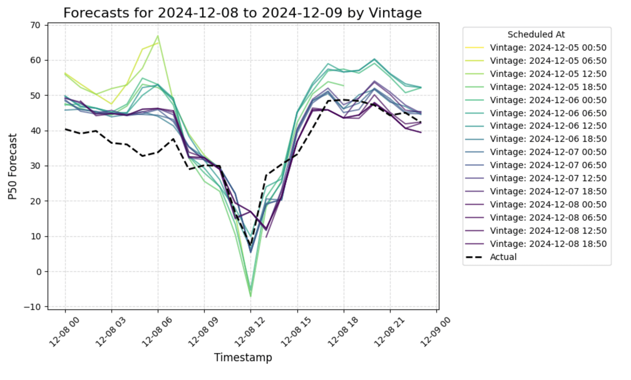
This chart will help visualize how forecasts change as the vintage approaches the timestamp or the 'time to delivery'.
    # Filter for a specific day
timestamp_start = '2024-12-08'
timestamp_end = '2024-12-09'

filtered_df = df[(df['timestamp'] >= timestamp_start) & (df['timestamp'] < timestamp_end)]

# Enter a series_name; default is RTLMP
series_name = 'RTLMP'
filtered_df = filtered_df[filtered_df['series_name'] == series_name]

# Pick an object_name; otherwise it will be random
object_name = 'object_name'

# Pick a model_id; otherwise, it will be random
model_id = 'model_id'

# Filter for a single model_id if multiple models exist
if model_id == 'model_id':
    model_id = filtered_df['model_id'].unique()[0]

filtered_df = filtered_df[filtered_df['model_id'] == model_id]

# Use a random price node for the visualization, or define your own
if object_name == 'object_name':
    object_name = filtered_df['object_name'].unique()[0]

filtered_df = filtered_df[filtered_df['object_name'] == object_name]

# Select relevant columns
filtered_df = filtered_df[['timestamp', 'scheduled_at', 'p50', 'actual', 'operating_hour_offset']]

# Sort by 'scheduled_at' and 'timestamp'
filtered_df = filtered_df.sort_values(by=['scheduled_at', 'timestamp'])

# Normalize operating_hour_offset for gradient
norm = plt.Normalize(filtered_df['operating_hour_offset'].min(), filtered_df['operating_hour_offset'].max())

plt.figure(figsize=(10, 6))

# Plot each vintage as a separate line with a gradient
for vintage in filtered_df['scheduled_at'].unique():
    vintage_data = filtered_df[filtered_df['scheduled_at'] == vintage]
    offset = vintage_data['operating_hour_offset'].iloc[0]
    color = cm.viridis(norm(offset))

    plt.plot(
        vintage_data['timestamp'],
        vintage_data['p50'],
        label=f"Vintage: {vintage.strftime('%Y-%m-%d %H:%M')}",
        color=color,
        alpha=0.7
    )

# Plot actuals as a single line
plt.plot(
    filtered_df['timestamp'].unique(),
    filtered_df.groupby('timestamp')['actual'].mean(),
    label='Actual',
    color='black',
    linestyle='--',
    linewidth=2
)

# Formatting the plot
plt.title(f"Forecasts for {timestamp_start} to {timestamp_end} by Vintage", fontsize=16)
plt.xlabel("Timestamp", fontsize=12)
plt.ylabel("P50 Forecast", fontsize=12)
plt.legend(title="Scheduled At", bbox_to_anchor=(1.05, 1), loc="upper left", fontsize=10)
plt.xticks(rotation=45)
plt.grid(True, linestyle='--', alpha=0.5)
plt.tight_layout()

# Show the plot
plt.show()

Hourly vintages allow the user to see how older forecasts (lighter lines) differ from more recently-made forecasts for the same hour of the day.
3. Vintage Metrics
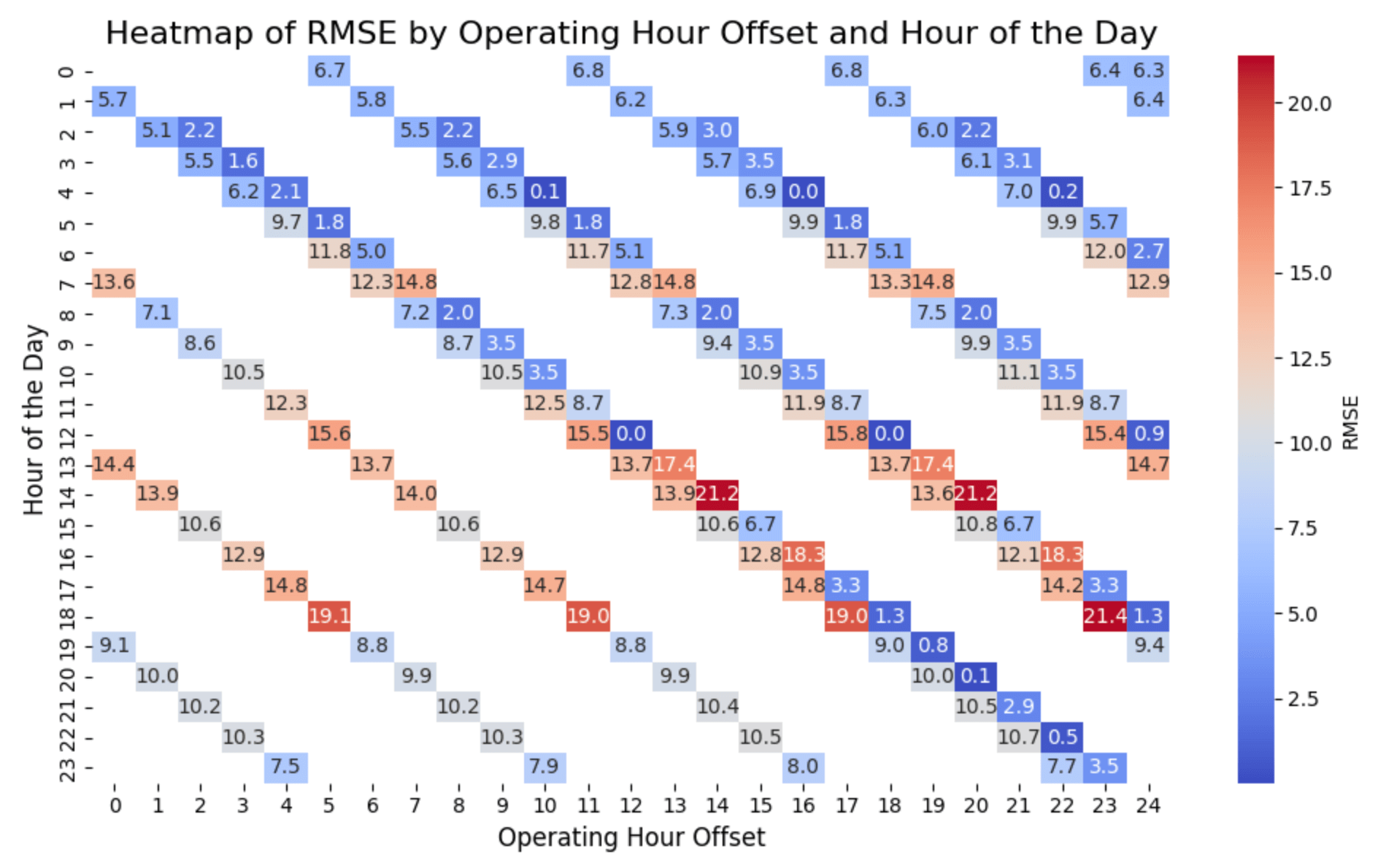
Now that we've visualized how vintages differ based on time to delivery, lets look at accuracy of the forecasts as it approaches the timestamp.
# Enter a series_name; default is RTLMP
series_name = 'RTLMP'
filtered_df = df[df['series_name'] == series_name]

# Only look at operating_hour_offsets up to 24
filtered_df = filtered_df[filtered_df.operating_hour_offset <= 24]

# Calculate RMSE for each operating_hour_offset and hour of the day
filtered_df['hour'] = filtered_df['timestamp'].dt.hour

filtered_df['abs_error'] = np.abs(filtered_df['actual'] - filtered_df['p50'])
filtered_df['squared_error'] = (filtered_df['actual'] - filtered_df['p50'])**2

heatmap_data = filtered_df.groupby(['operating_hour_offset', 'hour']).apply(
    lambda group: pd.Series({
        'MAE': group['abs_error'].mean(),
        'RMSE': np.sqrt(group['squared_error'].mean())
    })
).reset_index()

# Pivot the data for the heatmap
heatmap_pivot = heatmap_data.pivot(index='hour', columns='operating_hour_offset', values='RMSE')


# Plot the heatmap
plt.figure(figsize=(11, 6))
sns.heatmap(
    heatmap_pivot,
    annot=True,
    fmt=".1f",
    cmap="coolwarm",
    cbar_kws={'label': 'RMSE'}
)

# Formatting the plot
plt.title("Heatmap of RMSE by Operating Hour Offset and Hour of the Day", fontsize=16)
plt.xlabel("Operating Hour Offset", fontsize=12)
plt.ylabel("Hour of the Day", fontsize=12)
plt.tight_layout()

# Show the plot
plt.show()

Heatmap for illustrative purposes only. Gaps in heatmaps occur when vintages are run less frequently than hourly, because not all hours have vintages from every offset.
Conclusion
This tutorial provides a structured approach to evaluating same-day forecasts, enabling real-time desks to quickly identify forecast accuracy during volatile hours. By using this methodology, you can:
- Visualize forecast performance, including volatile and extreme price events.
- Inspect how a given forecasting model improves (or not!) as the time to delivery decreases
- Simplify the evaluation of vendor forecasts for your operational needs.
Feel free to modify the code and adapt it to your data and objectives!