Day-Ahead Analysis
This tutorial provides an in-depth guide for analyzing and visualizing day-ahead power market forecasts. The guide includes data preparation, metric calculation, and forecast visualization. By the end of it you will be able to:
- Know how forecasts have performed on a suite of relevant metrics (MAE, RMSE)
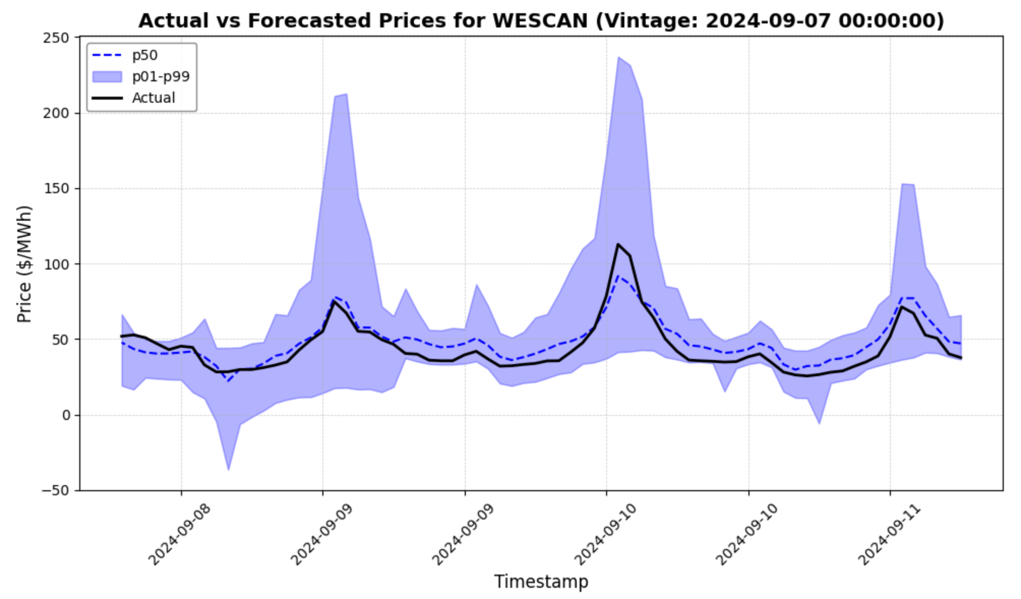
- Easily visualize how forecasts performed during volatile hours
- Customize the visualization for a date of your choice!
We've also written extensively about how to evaluate our forecasts conceptually on our blog.
1. Data Preparation
### Imports and Data

import pandas as pd
import matplotlib.pyplot as plt
import matplotlib.dates as mdates

df = pd.read_csv('data_sample_from_enertel.csv')
Ensure Consistent Timezone Handling
To ensure metrics are accurate, we enforce that all datetime columns have a single timezone.
# Verify that only one timezone is present
assert df['timezone'].nunique() == 1
timezone = df['timezone'].iloc[0]

# Convert datetime columns to timezone-aware datetime objects
for col in ["scheduled_at", "timestamp"]:
    df[col] = pd.to_datetime(df[col], utc=True).dt.tz_convert(timezone)

df.info()
2. Metric Calculation
It's generally a good idea to inspect how forecasts have performed on a variety of metrics.
Compute Forecast Accuracy Metrics
The following metrics are calculated for each combination of object_name and series_name:
- RMSE (p50): Root Mean Squared Error for p50 forecasts
- MAE (p50): Mean Absolute Error for p50 forecasts
- Count: Total number of forecasts
- Max Actual: Highest actual value
- Max p50: Highest p50 forecasted value
- Max p95: Highest p95 forecasted value
- Min/Max Date: Range of timestamps for the forecasts
import pandas as pd
import numpy as np

# Group by object_name and series_name to calculate metrics
metrics = []

for (object_name, series_name), group in df.groupby(['object_name', 'series_name']):
    rmse = np.sqrt(np.mean((group['p50'] - group['actual']) ** 2))
    mae = np.mean(np.abs(group['p50'] - group['actual']))
    n_forecasts = len(group)
    max_actual = group['actual'].max()
    max_p50 = group['p50'].max()
    max_p95 = group['p95'].max()
    min_date = group['timestamp'].min()
    max_date = group['timestamp'].max()

    metrics.append({
        'Object Name': object_name,
        'Series Name': series_name,
        'RMSE (p50)': round(rmse, 2),
        'MAE (p50)': round(mae, 2),
        'Count': n_forecasts,
        'Max Actual': round(max_actual, 2),
        'Max p50': round(max_p50, 2),
        'Max p95': round(max_p95, 2),
        'Min Date': min_date,
        'Max Date': max_date
    })

# Convert the metrics to a DataFrame
metrics_df = pd.DataFrame(metrics)

# Display the metrics DataFrame
metrics_df

3. Vintage Inspection
Customize Parameters for Vintage Inspection
Set parameters for the vintage_date, object_name, and model_id. Defaults are used if no values are provided.
# Enter a date; default is to use the day with the highest prices
vintage_date = 'YYYY-MM-DD'

# Enter a series_name; default is RTLMP
series_name = 'RTLMP'
filtered_df = df[df['series_name'] == series_name]


# Enter an object_name; default is the first object_name in the DataFrame
object_name = 'object_name'

# Enter a model_id; default is the first model_id in the DataFrame
model_id = 'model_id'

if vintage_date != 'YYYY-MM-DD':  # If a date is provided
  try:
      vintage_date = pd.to_datetime(vintage_date)
  except ValueError:
      raise ValueError("Invalid date format. Please use 'YYYY-MM-DD'.")

    # Filter the DataFrame for the input date
    filtered_df = filtered_df[filtered_df['scheduled_at'].dt.date == vintage_date.date()]

    if filtered_df.empty:
        raise ValueError(f"No data found for the given date: {vintage_date.date()}")

    # Handle duplicates by selecting the latest forecast (based on 'scheduled_at')
    latest_forecast_row = filtered_df.loc[filtered_df['scheduled_at'].idxmax()]
    scenario_id = latest_forecast_row['scenario_id']
else:  # Default to using the first available scenario
    scenario_id = filtered_df['scenario_id'].iloc[0]

# Filter the DataFrame for the selected scenario_id
max_price_df = df[df['scenario_id'] == scenario_id]

# Use a random price node for the visualization, or define your own
if object_name == 'object_name':
    object_name = max_price_df['object_name'].unique()[0]

max_price_df = max_price_df[max_price_df['object_name'] == object_name]

# Filter for a single model_id if multiple models exist
if model_id == 'model_id':
    model_id = max_price_df['model_id'].unique()[0]

max_price_df = max_price_df[max_price_df['model_id'] == model_id]

# Enhanced plot for actual and forecasted prices
plt.figure(figsize=(10, 6))

# Plot p50 forecast line
plt.plot(max_price_df['timestamp'], max_price_df['p50'], label='p50', color='blue', linestyle='--', linewidth=1.5)

# Add shaded uncertainty band for p01 to p95
plt.fill_between(max_price_df['timestamp'], max_price_df['p01'], max_price_df['p99'], alpha=0.3, label='p01-p99', color='blue')

# Plot actual values
plt.plot(max_price_df['timestamp'], max_price_df['actual'], label='Actual', color='black', linewidth=2)

# Format x-axis for dates
plt.gca().xaxis.set_major_formatter(mdates.DateFormatter('%Y-%m-%d'))
plt.gca().xaxis.set_major_locator(mdates.AutoDateLocator())
plt.xticks(rotation=45, fontsize=10)

# Add labels, title, grid, and legend
plt.xlabel('Timestamp', fontsize=12)
plt.ylabel('Price ($/MWh)', fontsize=12)
plt.title(f'Actual vs Forecasted {series_name} at {object_name} (Vintage: {vintage_date})', fontsize=14, fontweight='bold')
plt.grid(visible=True, linestyle='--', linewidth=0.5, alpha=0.7)
plt.legend(loc='upper left', fontsize=10, frameon=True, framealpha=0.9, edgecolor='gray')

# Adjust layout and show plot
plt.tight_layout()
plt.show()

Try it yourself by adjusting the vintage_date in the code snippet above - just make sure it's for a date in the sample!
Conclusion
The day-ahead forecast analysis presented in this tutorial offers a comprehensive framework for evaluating forecast performance and identifying patterns in predicted versus actual values. By leveraging metrics like RMSE and MAE, along with detailed vintage inspection, you gain a clear understanding of Enertel's forecast accuracy.
This approach is designed to:
- Facilitate an in-depth examination of forecast strengths and weaknesses.
- Enable easy customization for specific dates, objects, or scenarios.
- Provide insights into how well forecasts capture critical price dynamics, especially in high and low price hours.
We encourage you to adapt this workflow to your own datasets and compare forecast results against industry benchmarks.